5. TEXTURING
The decision to make my project cel-shaded (a way of using a "flat", stylistic kind of lighting to emulate 2D imagery) came not too long after I decided to stray away from realism. One day I thought, wouldn't it be cool if it kind of looked like a moving painting? At that point I was barely beginning the grasp the difference between NURBS and polygons, so it was something of a fit of madness for me to assume I could figure this out before four months were over. So I started experimenting very early on - even before I'd really done all my concept art or begun modeling. (I'm not putting any pictures of my early tests here because, frankly, they were embarrassingly terrible most of the time.) Fortunately, Maya comes with its own toon-shading engine - but it wasn't enough to give me the look I wanted.The problem with cel-shading is that things can look too simplified, to the point where the shape of an object becomes totally lost because it's only defined by two shades of color. And at the same time, I didn't want to just ape a 2D look with a 3D animation; I'd be missing out on the real advantages of both worlds. So I ended up using the nodes that Maya provided, and then I altered and added to them so that they could have just enough shade gradation to describe volume but keep the lighting stylized. The end result is sort of a 2.5D version of cel-shading.
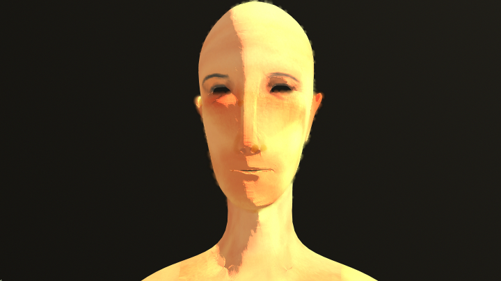
 As you can see in the above image, I was also experimenting with ways to make the edges of the model look less harsh. In this example, I tried using Maya's "toon outline" feature and altered it so that it wasn't a hard black line, but a blur effect that would change according to the camera angle. This image is an example of combining the blur outline, cel-shading with slight gradation, and a bump map layered onto hand painted textures.
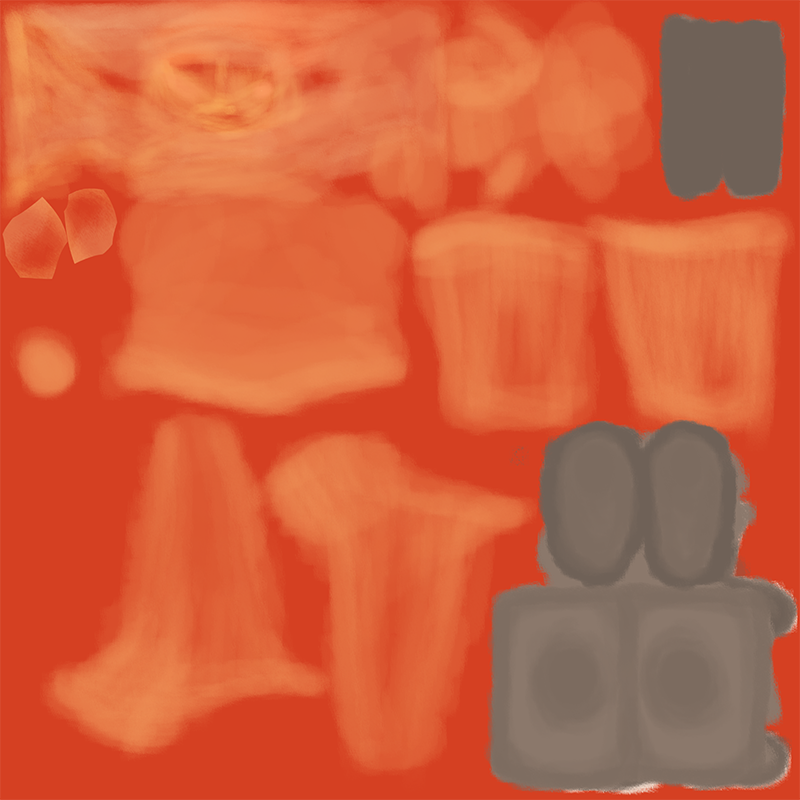
Those familiar with the texturing process will recognize these images as the UV layout of the model. For those who aren't, it's basically a lot like pelting an animal (skinning, not the throwing-things-at-it variety): you take the skin and keep it as whole as possible, cutting the seams where they would be least noticeable. Then, you can lay it back on top of the model and voila! Texture.
It was also around this point that I started thinking about how I'd represent the wind. In real life, half of the way we perceive wind is in the sound, and half of it is the way it affects things around it. But for my project, I wanted the wind to have something of a more physical presence - almost like it's a character of its own, both pushing the protagonist forward and also against her. It was while I was playing Pocahontas on one of my dual monitors (you know you watch movies as you work too, keyboard monkeys) that I saw one of Glen Keane's amazing scenes during the "Colors of the Wind" sequence:

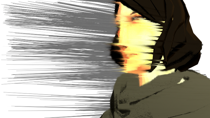
Not only was I blown away (heh) by this artwork, I suddenly saw the relation between it and my previous experimentation with "blur" toon-lines. What if I could have dozens of these lines and then I animated them? They would essentially be only visible as streaks of blurred color, but they would also exist in the 3D space of my animation. I could control where these lines appeared, so that I could focus on certain parts while blurring out others (like the above image where Pocahontas' face is clearly seen). My early experiments looked something like this:

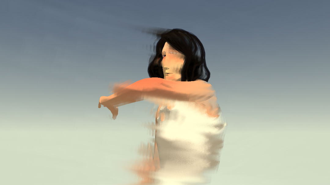
Obviously around this time, I had people look over my shoulder and say "Uh, Katie, what the hell are you doing?" I knew there was some work to go between what I had and what Glen Keane had - there were problems with the computer wanting to make everything as straight and spiky as possible. In the earliest versions, such as this one, I was attaching toon spikes to the character herself and hoping to achieve something like that Pocahontas picture. Eventually I realized that the wind is something the character is engulfed in, not emanating, and that it needed to move organically - not in straight lines. The solution was stupidly simple: instead of using spikes, I used a Paint Effects tool that already had more wind-like algorithms built in, to which I then attached the blur toon-lines. It let me have much more control over the appearance and placement of the wind (the Paint Effects tool even let me change various settings like its velocity, displacement, gravity, and density).

P R E V I O U S N E X T >>


